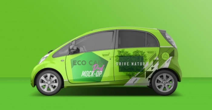
Vehicle wraps have always served to be an effective way of promoting a business. So, if you intend to use the wraps, then it’s important to go through the do’s and don’ts. If there’s something wrong, then you would never be capable to generate leads.
Do check out the vehicle
Before you start designing anything, you should always determine the size of the vehicle. Try taking photographs from every angle and measure the hood, rear, sides, and the bumpers. Later, you need to enlarge the photos as per the designer’s software. Remember to shoot direct shots and pay attention to the door handles, rivets, curves and every other detail. By spending some time, you can actually plan how to move on with customization. This is actually important when the graphics designer is thinking about a wrap. In fact, everything would ready from your end when you are discussing the requirements.
Don’t rely on digital templates
A template can only tell you more about how the vehicle looks like. It can offer the dimensional outline and the digital canvas on which ideas can be presented. But, in the end, you wouldn’t be aware of problems that you may encounter. The graphics designer has to go back to the drawing board if he has taken a print out the wrap and then discovered something odd.
Do your research
Like any creative project, gathering knowledge helps to come up with a great design. So, never proceed with any design till the time you have a long conversation with the client. It could be pertaining to the designs they like, designs they have observed, the color contrast and the message. It’s helpful to jot down the points so that the customer and the expert are on the same page.
Don’t be hasty
Any designer may think about completing the designing task immediately. However, this approach wouldn’t work because the person would then be portraying something else and far beyond the expectations. So, as you move on with the conversation, you must pay attention to specific design needs and the preferences. Developing conceptual ideas can meet the expectations and avoid the hustle of designing anything once again.
Do use bold colors
Vehicle wrap designs are always known to be big, bold and eye pleasing. It because these reasons they are noticeable whenever the vehicle passes across bustling streets. So, when the design is getting created, you should always think about visual elements that people would notice and remember. After all, you shouldn’t fall back in broadcasting the services to everyone around the city.
Don’t make the design gaudy
Even though vehicle wraps are colorful and eye-catching, you shouldn’t pack the design with various elements and imagery. The most effective vehicle wrap designs are colorful but they look quite sophisticated with respect to the composition. Keep everything simple so that you avoid the unnecessary clutter and let the message stand out.
Do note the brand’s message
Unlike a design printed on paper, a vehicle wrap always captures the attention when the viewer has some time to look at the message. So, thinking out-of-the-box can enhance the brand image and let others understand the message immediately.
Do seek approval
Don’t take any step further till approval is sought for the artwork. No matter what might be the deadline, it’s important to get a green signal from the client. In case the client is disappointed about something, then the graphics designer has to do everything right from the start. He may get frustrated when the schedule gets disturbed and he has many other assignments to complete.
Don’t disregard the requirements
Every design is always based on the collaboration between the client and the designer. So, as a design expert, it’s always better to guide the client and give advice. But, you shouldn’t argue with the person since he would be reviewing the design and paying you after the job is done. You should always be open to communicate for discussing the changes and getting approvals on time.
Don’t paste an advertisement copy
The sole purpose of pasting a vehicle wrap is to let others know about your brand, the services and where the business is established. But, if you are going to paste an advertising copy then it can certainly distract people. The option could certainly be thought about when you are trying to highlight a short message.
It may take some time to build trust with a new client. But, once he is contented, he would be paying the designer and coming back with some other assignment.
Finally, you shouldn’t select the font just because it appears trendy. For making the small text look prominent, you should look for a spot where the text is readable and doesn’t get distorted. In case the small text is around the groove, crease or bump, then it would be distorted and not appear clear to the eyes. Everything would sound worthless when nobody would be able to make out what you need to deliver.
